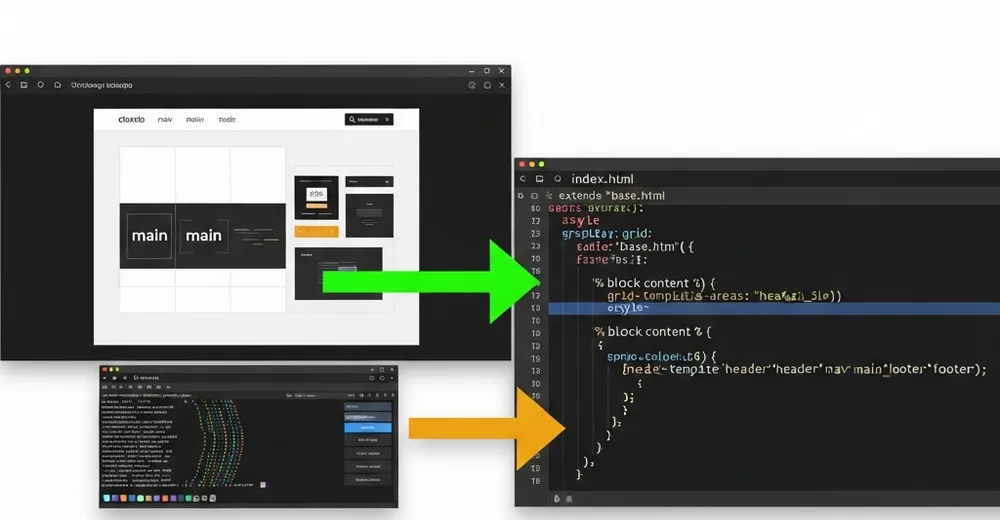
In the first part, the focus was on the result: one prompt, three designs, one of them (“Terminal Editorial”) is now this site. This part goes one level deeper – into the code handoff between claude.ai/design and Claude Code. Because that’s exactly where it’s decided whether a pretty prototype becomes a maintainable template.
Ad · Affiliate link – if you buy through it, I may earn a commission. It doesn’t change the price for you.

What Claude Design delivers – and what it doesn’t
claude.ai/design gives you a static hi-fi prototype: HTML with Tailwind classes, daisyUI components and hardcoded placeholder data. It looks finished in the browser – but it’s not a Django template. Everything that makes a CMS is missing: {% extends %}, {% for %} loops, {{ page.field }} variables, i18n, and above all the bridge to your data model.
The handoff is therefore not copy-paste, but a translation: from the mockup with fake data to the template that renders real Wagtail pages. That translation is exactly what Claude Code took on.
The hero-grid: mobile-first with grid-template-areas
The most striking element is the hero. In the prototype the order on desktop was fixed: text left, image right. On mobile a different order is needed – title first, then image, then description and call-to-action. Instead of two separate markup blocks, grid-template-areas solves this with one markup and two layouts:
{# Mobile: title → image → dek/tags/CTA.
   Desktop (lg): text left, image right (grid-template-areas). #}
<section class="hero-grid px-4 sm:px-6 lg:px-10 pt-10 pb-10">
  <div class="hero-head min-w-0" data-cat="{{ hero.category.slug }}">
    ...
    <h1 class="display-title text-[clamp(2.25rem,4vw,3.5rem)]">
      <a href="{{ hero.get_absolute_url }}">{{ hero.title }}</a>
    </h1>
  </div>
  <div class="hero-rest min-w-0"> ... dek, tags, CTA ... </div>
  <div class="hero-media min-w-0"> ... image or code-frame ... </div>
</section>/* Mobile: everything stacked, image between head and rest */
.hero-grid {
display: grid;
grid-template-areas: "head" "media" "rest";
gap: 1.5rem;
}
.hero-head { grid-area: head; }
.hero-media { grid-area: media; }
.hero-rest { grid-area: rest; }
/* Desktop: two columns, text left, image right across both rows */
@media (min-width: 1024px) {
.hero-grid {
grid-template-columns: 1fr 1fr;
grid-template-areas:
"head media"
"rest media";
gap: 2.5rem 3rem;
}
}The clever part: the DOM order stays the same (good for screen readers and tab order), only the visual arrangement flips at the breakpoint. clamp() in the title size additionally saves half a dozen Tailwind breakpoint classes – the font scales fluidly between 2.25rem and 3.5rem.
kicker-prompt & code-frame: terminal aesthetics via CSS
The design lives off the terminal metaphor. Above each hero sits a fake shell prompt with a blinking cursor that shows the page’s slug as a filename:
<div class="kicker-prompt mb-4 flex items-center gap-2.5 flex-wrap">
  <span>cat featured/</span>
  <span class="text-base-content break-all">{{ hero.slug }}.md</span>
  <span class="cursor"></span>
</div>
The cursor is pure CSS – no JavaScript, no animation library:
.cursor {
  display: inline-block;
  width: 0.6ch;
  height: 1.1em;
  background: var(--p); /* daisyUI primary */
  animation: blink 1.1s step-end infinite;
}
@keyframes blink { 50% { opacity: 0; } }
More interesting is the code-frame: if an article has no hero image, the template renders a fake editor instead – traffic-light dots, line numbers and a code excerpt. It’s the fallback that keeps the homepage coherent even without a single image:
{% elif hero.hero_code %}
<figure class="code-frame">
  <header class="code-frame__bar">
    <span class="dot dot--r"></span>
    <span class="dot dot--y"></span>
    <span class="dot dot--g"></span>
    <span class="path">~/{{ hero.slug }}/main.py</span>
  </header>
  <div class="code-frame__body">
    <div class="code-frame__lines">
      {% for n in hero.hero_code_lines %}<div>{{ n }}</div>{% endfor %}
    </div>
    <div><pre class="m-0">{{ hero.hero_code }}</pre></div>
  </div>
</figure>
The actual work: retrofitting model properties
This is where the work hides that’s invisible in the prototype. The design naturally uses variables like hero.dek, hero.read_minutes, hero.commit_hash, hero.comment_count and hero.hero_code_lines – in the mockup those were placeholders. In Wagtail these fields simply don’t exist. To stop the template from crashing with VariableDoesNotExist on the first render, they had to go into the model. Some as real fields, but most as computed @property:
import re
from django.utils.functional import cached_property

class ArticlePage(Page):
    # ... existing fields ...

    @cached_property
    def read_minutes(self):
        """Rough reading time: ~200 words/minute across all text blocks."""
        words = 0
        for block in self.body:
            text = str(getattr(block.value, "source", block.value))
            words += len(re.sub(r"<[^>]+>", " ", text).split())
        return max(1, round(words / 200))

    @property
    def commit_hash(self):
        """Decorative 'commit' – stable per page, purely cosmetic."""
        return f"#{self.id:07x}"

    @property
    def dek(self):
        """Reuse existing fields instead of inventing a new one."""
        return self.subtitle or self.search_description or self.introduction
That’s the honest lesson: an AI design invents the vocabulary it would like to have. The art of the handoff is mapping that vocabulary onto existing data instead of blindly adding new fields. dek is simply my subtitle, commit_hash is cosmetic from the ID, read_minutes is computed. Not a single new migration field where a property does the job.
An AI design describes what your data should look like. The handoff is the point where you decide whether to bend the model or build the property.
Responsive partials instead of copy-paste
The prototype repeated the card markup inline for every article. Claude Code broke that into reusable includes – partials/v1/card.html for the featured row, row.html for the compact list of older posts, sidebar.html for the tag cloud. The homepage just calls them in loops:
{# Featured: exactly one row, max. 3 articles #}
<section class="grid grid-cols-1 sm:grid-cols-2 md:grid-cols-3 gap-8">
  {% for post in featured|slice:":3" %}
    {% include "partials/v1/card.html" %}
  {% endfor %}
</section>

{# Older posts as compact rows + sidebar #}
<section class="grid grid-cols-1 lg:grid-cols-[1fr_280px] gap-10">
  <div>
    {% for post in latest %}{% include "partials/v1/row.html" %}
    {% empty %}<p>$ ls posts/ — no matches</p>{% endfor %}
  </div>
  {% include "partials/v1/sidebar.html" %}
</section>
Here’s what the finished Terminal Editorial layout looks like live – hero on the left, code-frame/image on the right, the featured row below:

Don’t forget i18n
A static prototype knows no languages. devmaker.net, however, is bilingual (DE/EN). Every hardcoded string in the template – “latest writeups”, “older posts” – had to be replaced with {% translate %}, otherwise the English page would have shown German section headers:
{% load i18n %}
<div class="...">
  <span class="text-primary">~/posts</span>
  <span>/</span>
  <span>{% translate "latest writeups" %}</span>
</div>
...
<div>// {% translate "older posts — sorted by date desc" %}</div>
Lessons learned
- The prototype is a specification, not a product. Treat it like a detailed requirements doc in HTML – not finished code.
- The AI invents data fields. Budget time to map its wish-list vocabulary onto your real model. Properties before migrations.
- Fallbacks are worth their weight in gold. The code-frame for image-less articles was Claude Design’s idea – and exactly what saves a tech homepage from forced stock photos.
- What I left out: the prototype had an animated tag-filter bar with JS. Deliberately dropped – not over-engineered, the value was too small for the complexity.
Conclusion
The “magic” moment isn’t the design – it’s the handoff. claude.ai/design delivers the vision, Claude Code turns it into a template that copes with real data, two languages and missing images. The effort shifts from pushing pixels to cleanly mapping design assumptions onto the data model – and that’s exactly the work a mockup never shows.
Ad · Affiliate link – if you buy through it, I may earn a commission. It doesn’t change the price for you.