I'm a developer, not a designer. devmaker.net had a solid stack – Wagtail, Tailwind CSS, daisyUI – but the design was what you get when a backend developer takes daisyUI defaults and hopes it looks good enough. It was functional. It wasn't bad. But it also wasn't mine.
The question was: how do you, as a solo developer without a design background, arrive at a professional, characterful design – without learning Figma, without paying a freelance designer, without weeks of trial and error?
The answer was surprisingly short.
Ad · Affiliate link – if you buy through it, I may earn a commission. It doesn’t change the price for you.

The tool: claude.ai/design
claude.ai/design is Anthropic's design tool, integrated directly into claude.ai. The decisive difference from other AI design tools: it can work with real project files. Instead of a text description, you hand over your existing templates, your CSS configuration, your component system. The tool then understands what you already have – and works with it instead of against it.
For me that meant uploading my Tailwind config, daisyUI setup and my existing Django/Wagtail templates. After that the AI knows which classes are available, which components exist, and the context the design has to land in.
The prompt
This was my complete initial prompt:
improve this tech blog. it uses tailwind css with daisyuiOne sentence. No moodboard. No color palette. No reference screenshot. Along with it I uploaded the template files and the design system – the actual work sat in those constraints, not in the prompt.
The three follow-up questions
Instead of diving straight in, Claude Design asked questions. Three targeted ones:
- Hi-Fi or Lo-Fi design? → Hi-Fi
- Interactive prototype? → Yes
- Theme preference? → (selection from suggestions)
This is the moment that shows the tool works professionally: it asks for what it needs instead of hallucinating assumptions. A lo-fi wireframe and a worked-out hi-fi design are completely different deliverables – the question makes sense.
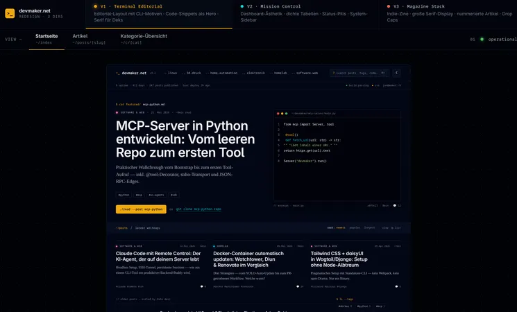
Three designs, one decision
Claude presented three fully worked-out hi-fi concepts – all based on my existing Tailwind components and daisyUI classes:
- V1 · Terminal Editorial – editorial layout with CLI motifs, code snippets as the hero element, serif typography for deks. Dark, technical, characterful.
- V2 · Mission Control – dashboard aesthetics, dense tables, status pills, system sidebar. More app than blog.
- V3 · Magazine Stack – indie-zine style, large serif display font, numbered articles, drop caps. Editorial, but different.
No generic Bootstrap output. No interchangeable layouts. Three real design directions with a clear identity.
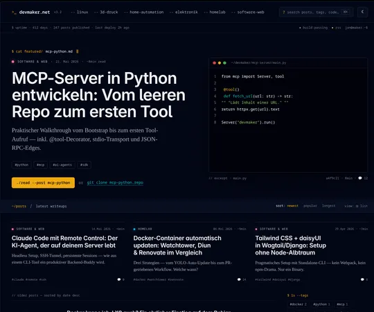
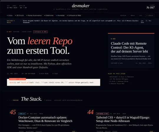
Why Terminal Editorial?
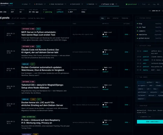
Terminal Editorial won because it fits my blog best: it feels like a tech blog from someone who actually lives in the terminal. CLI prompts as navigation, cat featured/ as a kicker, ./read --post as a CTA button – that's not decoration, that's identity.
V2 (Mission Control) would be interesting for a monitoring dashboard, but too app-like for a blog. V3 (Magazine Stack) was visually strong, but the indie-zine style doesn't fit the pragmatic, direct tone of devmaker.net.
From design to code: Claude Code takes over
Here the workflow comes full circle: the finished design from claude.ai/design was handed directly to Claude Code. Claude Code adapted the existing Wagtail templates, applied Tailwind classes correctly – inventing no new ones – and kept the daisyUI components intact.
What surprised me: the generated templates were clean. No copy-paste CSS chaos, no inline styles, no class explosion. For comparison – this is what the original homepage looked like:
{# Before: standard Swiper carousel + grid #}
<section class="mb-12">
  <div class="swiper w-full p-0 shadow-md hover:shadow-xl">
    <div class="swiper-wrapper p-0 m-0">
      {% for article in page.get_latest_3_articles %}
        {% article_carousel_cards article %}
      {% endfor %}
    </div>
    <div class="swiper-button-prev"></div>
    <div class="swiper-button-next"></div>
  </div>
</section>

<div class="grid grid-cols-1 md:grid-cols-2 xl:grid-cols-2 gap-8">
  {% for article in page.get_latest_articles %}
    {% article_cards article %}
  {% endfor %}
</div>
After that – the Terminal Editorial hero with CLI kicker and code frame:
{# After: Terminal Editorial hero #}
<section class="hero-grid px-4 sm:px-6 lg:px-10 pt-10 sm:pt-14 pb-10">
  <div class="hero-head min-w-0" data-cat="{{ hero.category.slug }}">

    {# CLI kicker: cat featured/slug.md #}
    <div class="kicker-prompt mb-4 flex items-center gap-2.5 flex-wrap">
      <span>cat featured/</span>
      <span class="text-base-content break-all">{{ hero.slug }}.md</span>
      <span class="cursor"></span>
    </div>

    <h1 class="display-title text-[clamp(2.25rem,4vw,3.5rem)]">
      <a href="{{ hero.get_absolute_url }}" class="hover:text-primary transition-colors">
        {{ hero.title }}
      </a>
    </h1>
  </div>

  {# CTA in terminal style #}
  <a href="{{ hero.get_absolute_url }}"
     class="btn btn-primary rounded-md font-mono normal-case h-auto py-2.5">
    ./read --post {{ hero.slug }}
  </a>

  {# Code frame as fallback when no hero image #}
  <figure class="code-frame">
    <header class="code-frame__bar">
      <span class="dot dot--r"></span>
      <span class="dot dot--y"></span>
      <span class="dot dot--g"></span>
      <span class="path">~/{{ hero.slug }}/README.md</span>
    </header>
    <div class="code-frame__body">
      <pre class="m-0"># {{ hero.title }}

{{ hero.dek|truncatewords:18 }}</pre>
    </div>
  </figure>
</section>
Lessons learned
- Constraints are the key. Handing over Tailwind + daisyUI as input kept Claude from drifting into the generic. "Make a cool tech blog" without context would probably have produced an interchangeable Bootstrap result. The existing files were the real prompt.
- Asking back > hallucinating. The fact that Claude Design asked questions instead of just diving in raised the quality drastically. Hi-Fi vs. Lo-Fi isn't a detail – it's the difference between a wireframe and a finished design.
- Three options is the right number. Not so many you feel overwhelmed, not so few you have no real choice. Each one had a clear identity.
- Design → code handoff works. The transition from claude.ai/design to Claude Code was seamless. No manual translation steps, no loss in interpretation.
- The quality of the generated templates surprised me. Clean HTML, correct Tailwind classes, no anti-patterns. This wasn't "just good enough to start with" – it was directly usable.
Conclusion
claude.ai/design is not a magic button that makes a good design out of nothing. But if you bring an existing design system – Tailwind, daisyUI, Material UI, whatever – it gets concrete. The workflow of design tool + coding agent is a real game-changer for solo developers without a design background.
The result is this page right here. And on my own I wouldn't have pulled off this quality.
Ad · Affiliate link – if you buy through it, I may earn a commission. It doesn’t change the price for you.